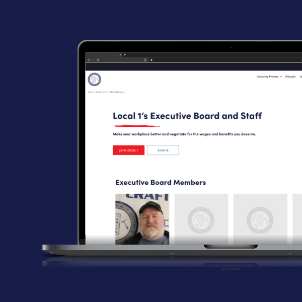
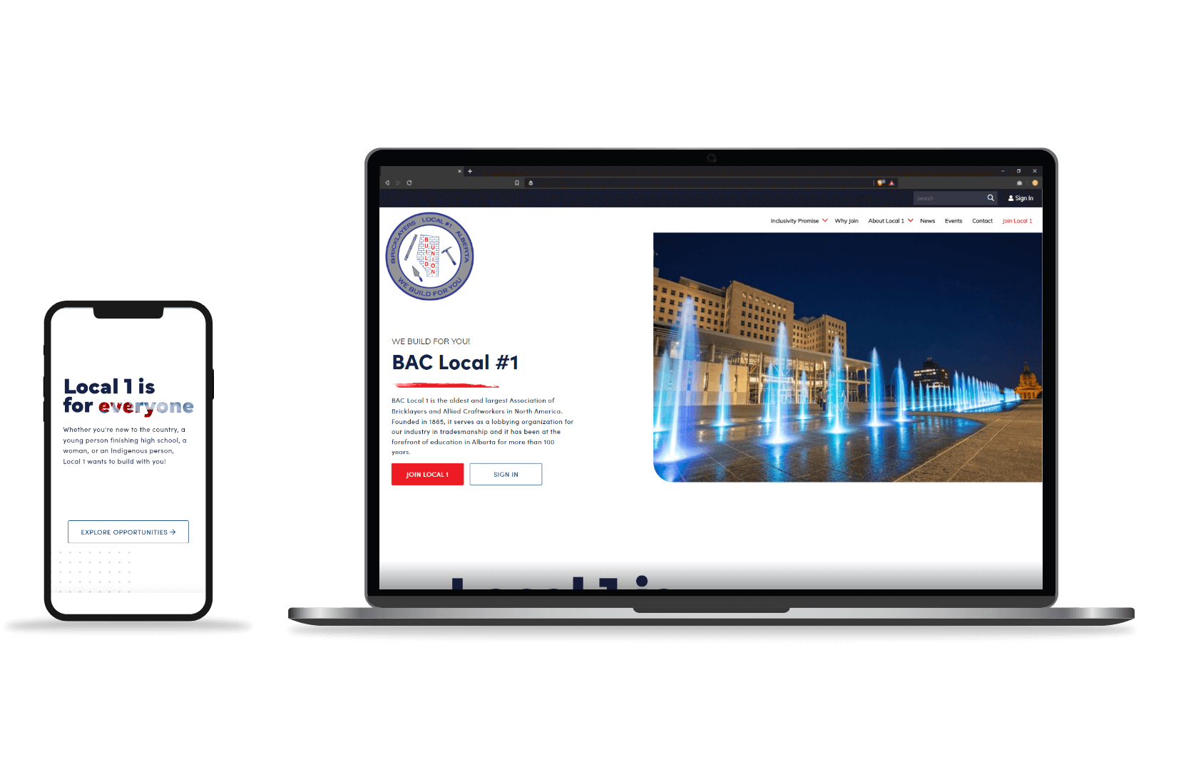
BrandingBAC Local 1The BAC Local 1 Union came to us for a redesign and fresh, rebranding in order to modernize their brand for their members. We quickly rose to the challenge and began developing the new and improved digital presence for the union. |
 |
 |
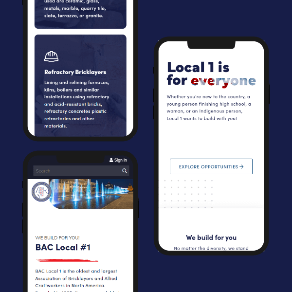
Designing around a new audienceWith a member base that is largely approaching retirement, the BAC Local 1 Union tasked our designers with developing a design direction for a youth audience. This would allow the union to more easily communicate their messages to those who are soon to enter the workforce.
|
 |
 |
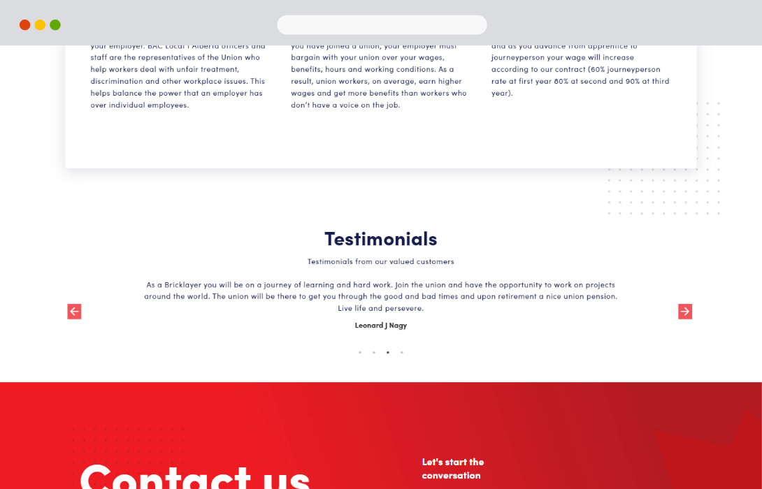 |
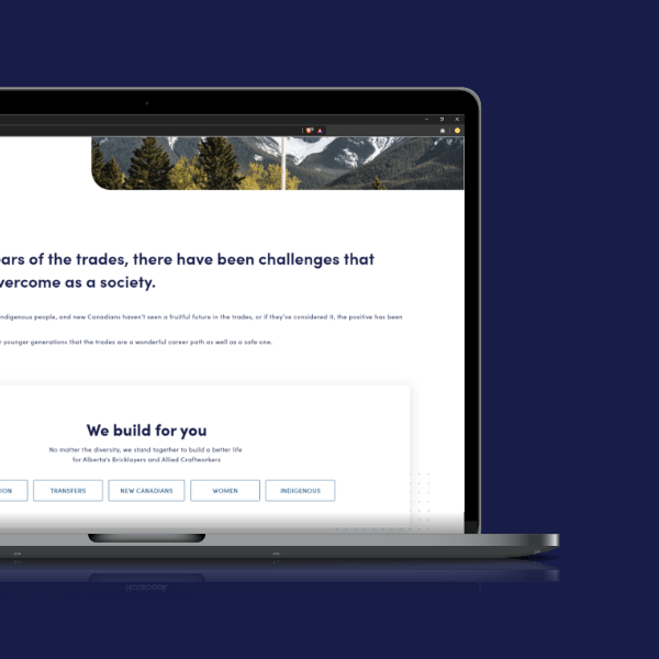
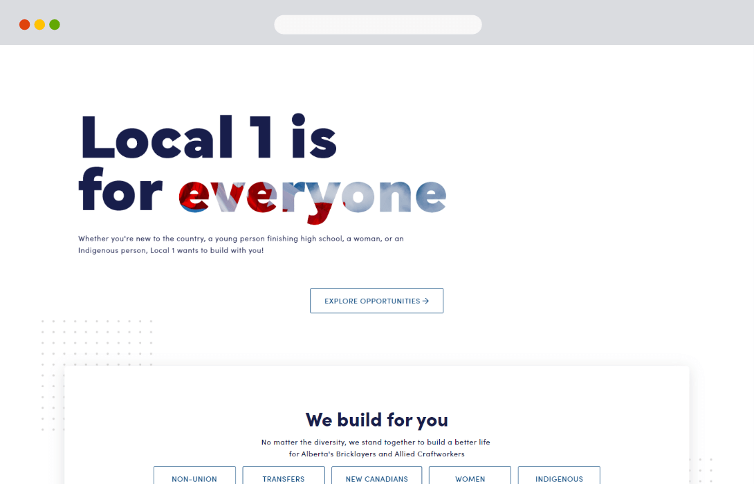
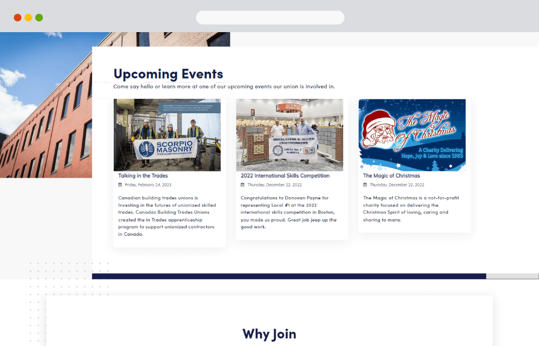
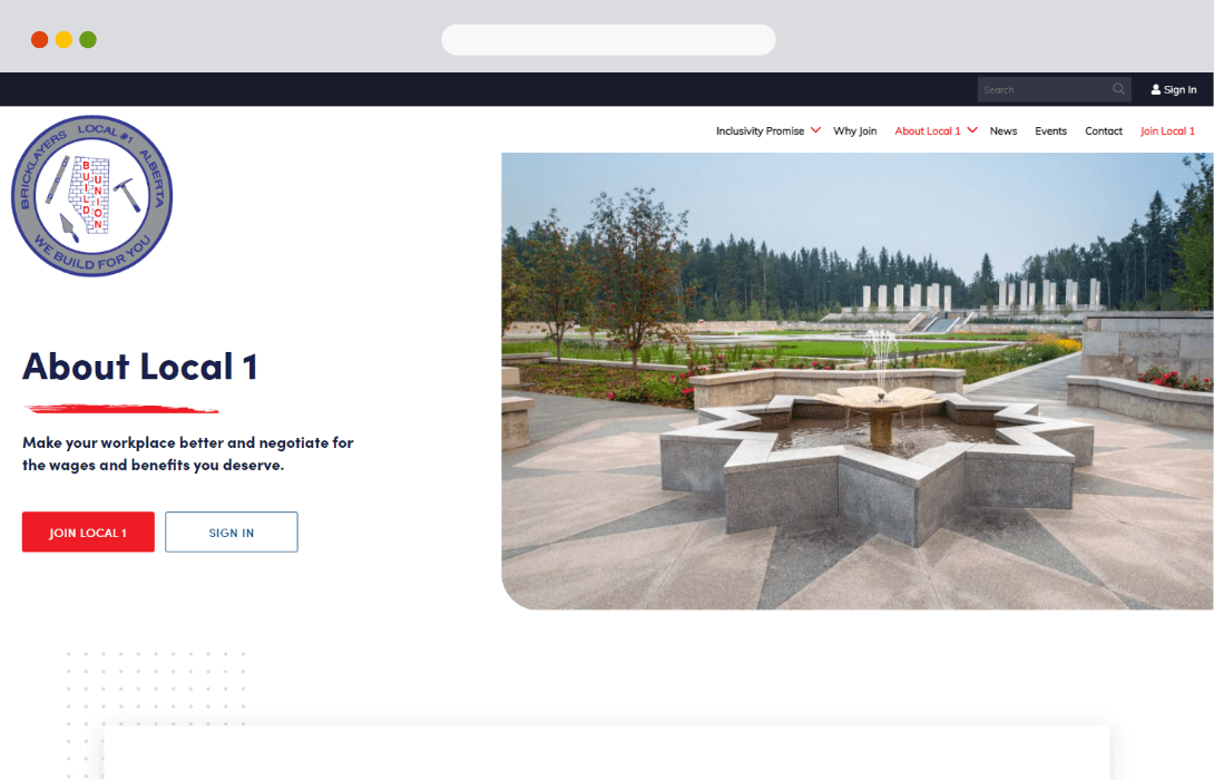
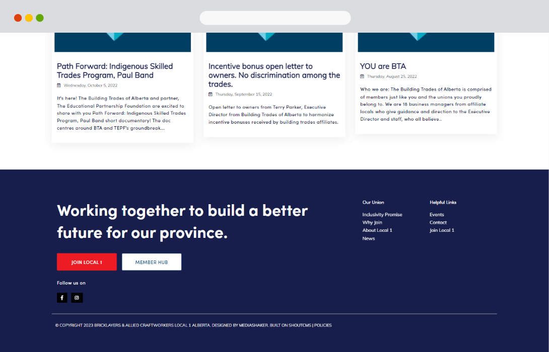
Big and bold design choicesA key aspect of the overall design direction involved creating bold sections that were also easy to read through. It became apparent through our design research that too much 'visual noise' would make the site hard to use for younger users, while still needing a great presentation to maintain their attention. |
 |
 |
Creating a custom solutionWe took all of our conversations and research, carefully transforming it into a 100% custom design direction for the BAC Local 1 Union. Every choice was made around their needs, while adhering to well-researched trends regarding their target audiences. |
Developed around the end-userFrom minor typographic details to how page layouts are determined, our design team planned out the BAC Local 1 website around a youth audience. This minor details worked together to create a seamless browsing experience for this audience. |

 |
|
Laying the foundation for a more modern futureThe new BAC Local 1 website provides a great example of how well-planning a design can help create lasting, positive effects for a member organization. Carefully made design decisions and site-mapping have helped the BAC Local 1 prepare their union for new prospective members from across Alberta. |

